Clear hierarchy
Stronger typography, spacing and contrast guide visitors naturally through the content.
CLIENT PROJECT / 2026
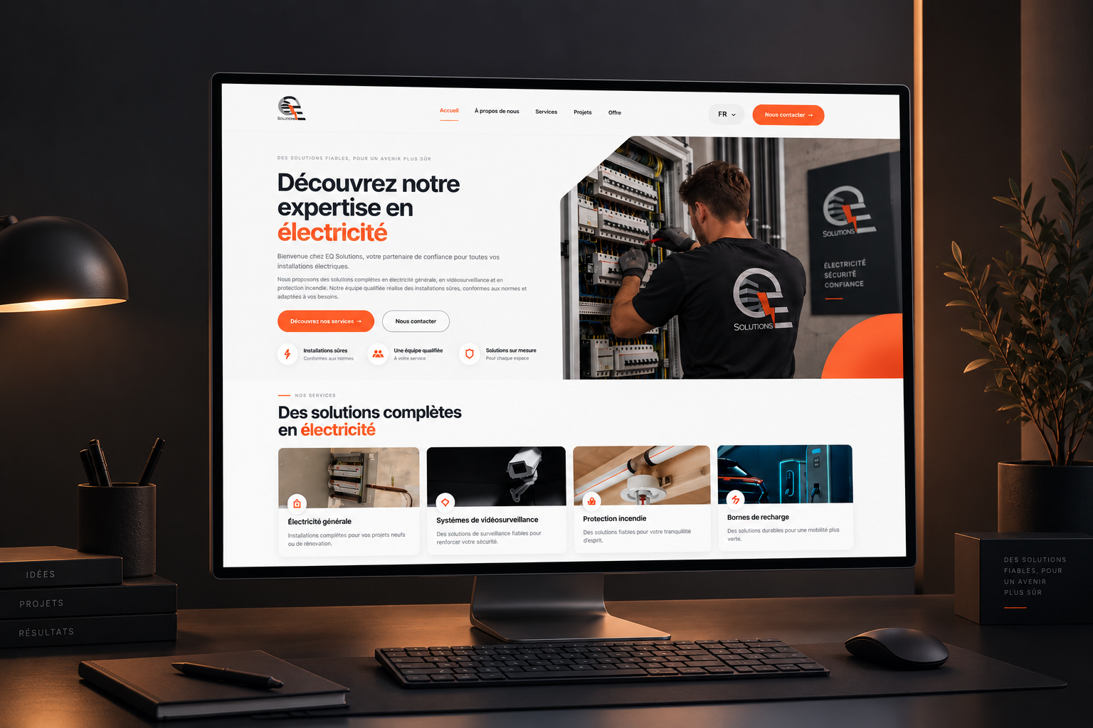
An ongoing client project I designed and developed from the ground up, and later revisited to create a more modern digital experience.
01 / THE BRIEF
My work with EQ Solutions started with the creation of their original website. I designed and developed the website from the ground up, translating the company's services and identity into its first digital experience.
Later, the client came back to me with a new request. As the business evolved, they wanted the website I had originally created to feel more modern and better reflect where the company is today.
We met to discuss what they wanted to change, what should stay recognisable and where the experience could be improved. During that conversation, I also advised the client from my design and development perspective, helping define a direction that balanced their wishes with usability, hierarchy and responsive design.
02 / THE DIRECTION
Because I had already designed and developed the original website, I knew both the existing experience and the company behind it. The redesign wasn't about starting over, but about evolving what I had previously created into something more modern, confident and refined.
CLIENT COLLABORATION
When the client returned for the redesign, we met to discuss how their needs had changed since the original website was created and what they wanted the next version to communicate.
I combined their feedback with my own design and development expertise, advising on hierarchy, usability, structure and responsive behaviour before translating that direction into the redesigned website.
Stronger typography, spacing and contrast guide visitors naturally through the content.
A cleaner interface gives the company a more contemporary and professional digital presence.
Services and actions are easier to discover, understand and navigate.
03 / BEFORE & AFTER
Both versions were designed and developed by me. The original website established EQ Solutions' online presence, while the redesign builds on that foundation with a more modern and refined experience.
DRAG TO COMPARE ↔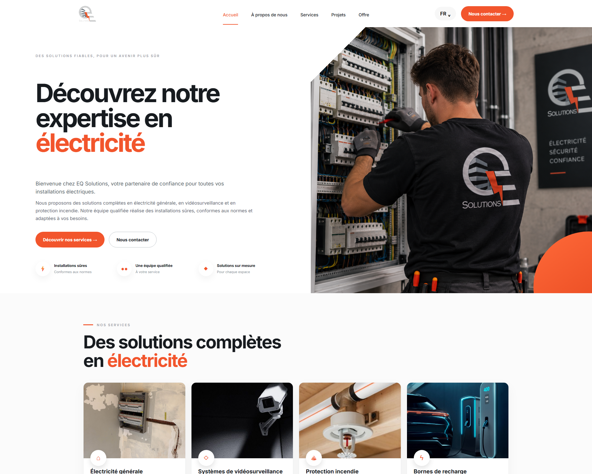
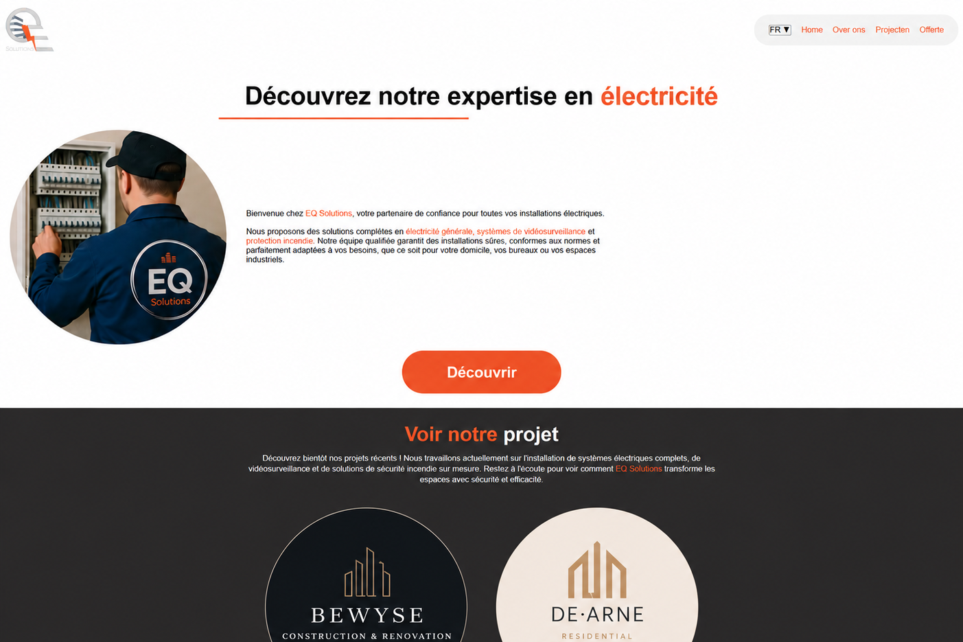
My work with EQ Solutions started with the original website. I designed and developed the experience from the ground up, creating the structure, visual direction and responsive website for the client.
When the same client later wanted a more modern website, we revisited the experience together. I used the original work as a foundation and redesigned it to better reflect the company today.
04 / WHAT CHANGED
A clearer hero and stronger visual hierarchy immediately communicate what EQ Solutions does and establish a more professional first impression.
↗Important services are presented earlier and more visually, helping potential customers quickly understand what the company offers.
↗Important actions have more visual weight so visitors always know where to go next.
↗The interface adapts across different screen sizes while preserving the same hierarchy and visual direction.
↗05 / DESIGN & DEVELOPMENT
I redesigned the visual experience with a focus on hierarchy, readability, responsive behaviour and a more contemporary presentation of the company.
After defining the new visual direction, I translated the design into a responsive website and refined the interactions across the experience.
THE RESULT
EQ Solutions shows how my work can evolve alongside a client. I first designed and developed their original website, and later worked with them again to rethink and modernise that same experience. The redesign builds on the foundation of my original work while responding to the company's new needs and direction.